

Master Chart
Master Chart allows you to analyze metrics for a selected period for one or several locations, compare data for different periods, and compare several metrics with each other.
Data can be viewed in two modes:
- Chart — for analyzing metric trends
- Table — for viewing exact values by period. For more information, see Table
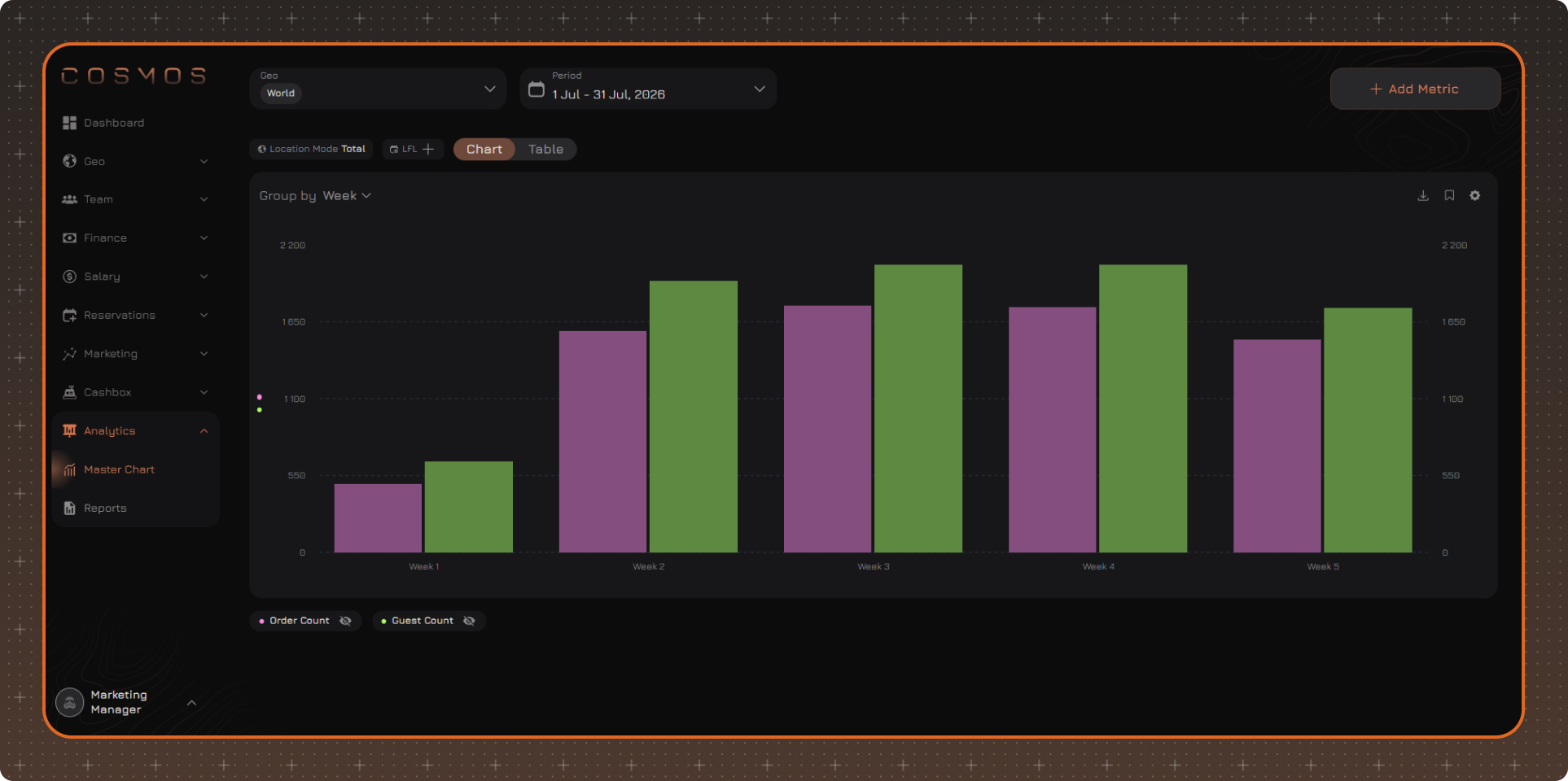
When switching between modes, the selected metrics and settings are kept.
To get started, add at least one metric. For more information on creating and configuring metrics, see Create Metric.
If there is no data for a metric with the selected settings, the metric remains in the legend but is not displayed on the chart.
Master Chart Settings
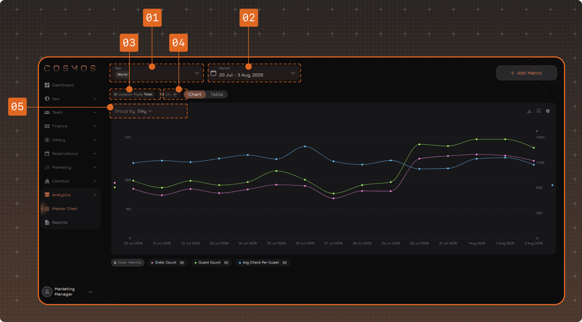
1. Geo
Defines the locations for which metrics are calculated. You can select one or several locations, a region, or World — all locations in all regions.
How data for several selected locations is combined is set in the Location Mode setting.
2. Period
The period is calculated by cash shifts: the data includes shifts opened within the selected date range.
3. Location Mode
Defines how data for the selected locations is displayed:
- Total — data for the selected locations is combined. Several metrics can be displayed at the same time
- Separately — data for each location is displayed separately. Only one metric can be displayed at a time
- One VS Others — data for the selected location is compared with data for the other selected locations. Only one metric can be displayed at a time
4. LFL
LFL allows you to compare metrics for the selected period with another period using the same settings.
Select the period for comparison:
- Previous Period — the previous period of the same length
- Same Period Last Year — the same period of the previous year
- Custom Period — a period set manually
The change in percent is displayed for the compared values.
5. Group By
Data can be grouped by day, week, month, quarter, half-year, or year.
The system automatically sets a suitable grouping depending on the selected period. If necessary, you can change it manually.
Each point or bar on the chart corresponds to the selected grouping interval. For example, when grouping by week, metric values for each week are displayed.
Chart Display
Click the gear icon to change the chart display settings.
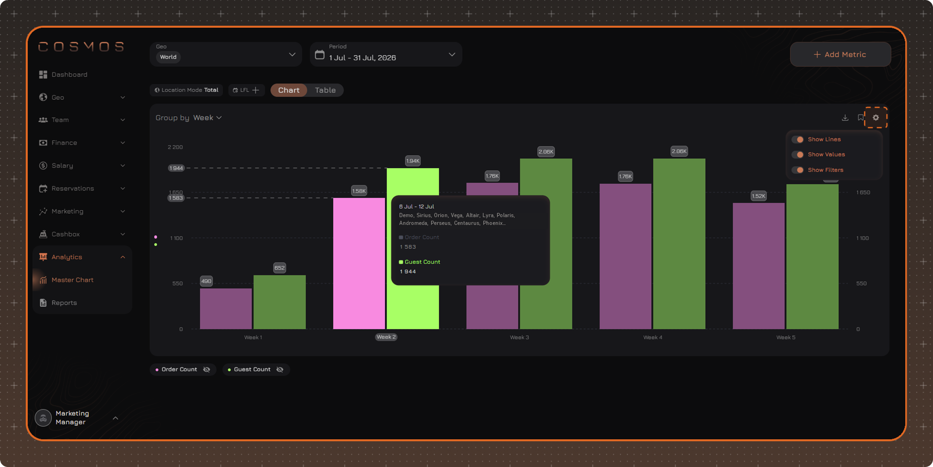
- Show Lines — enables guide lines when hovering over the chart
- Show Values — displays values directly on the chart
- Show Filters — displays the filters applied to the metric in the tooltip on hover
When hovering over a point or bar, information for the corresponding grouping interval is displayed: the period, the selected locations, and the metric name and value. If there are several metrics on the chart, the tooltip shows the value of each of them.
Value Scales
The chart can display two Y-axis scales at the same time: one on the left and one on the right. Scales are used for metrics with different units of measurement — for example, revenue and order count.
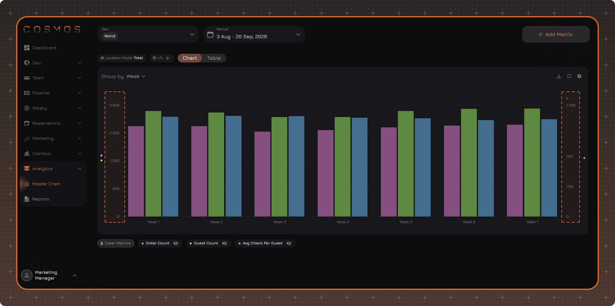
If a metric requires a third scale to be displayed, the metric remains in the legend but is not displayed on the chart.
Legend
The legend shows all added metrics.
The following actions are available for each metric:
- click the eye icon to hide or show the metric on the chart
- click the metric name to open its settings
A hidden metric remains in the legend and is not removed from the Master Chart.
If there is no data for a metric or it requires a third scale to be displayed, the metric remains in the legend but is not displayed on the chart.
Table
The Table mode shows the same data as the chart, but in table form. Use it when you need exact values for each period. The chart is better suited for analyzing trends.
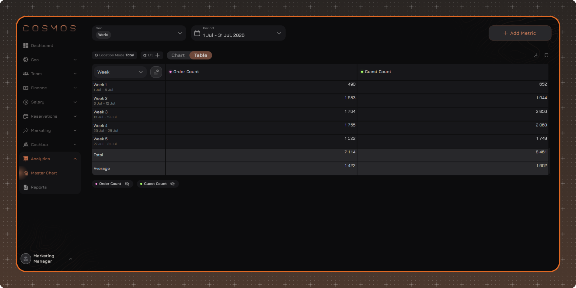
Table rows correspond to the selected grouping intervals, and the added metrics are displayed in separate columns.
If there is no data for a certain period, the cell shows No Data.
Location Mode affects the metric columns in the table:
- Total — one column per metric with the combined value for the selected locations
- Separately — a separate column per location for each metric
- One VS Others — two columns per metric: the selected location and the other locations combined
When LFL is enabled, each metric shows the value for the selected period, the value for the comparison period, and the change in percent.
Table Settings
Click the settings icon next to the grouping selector.
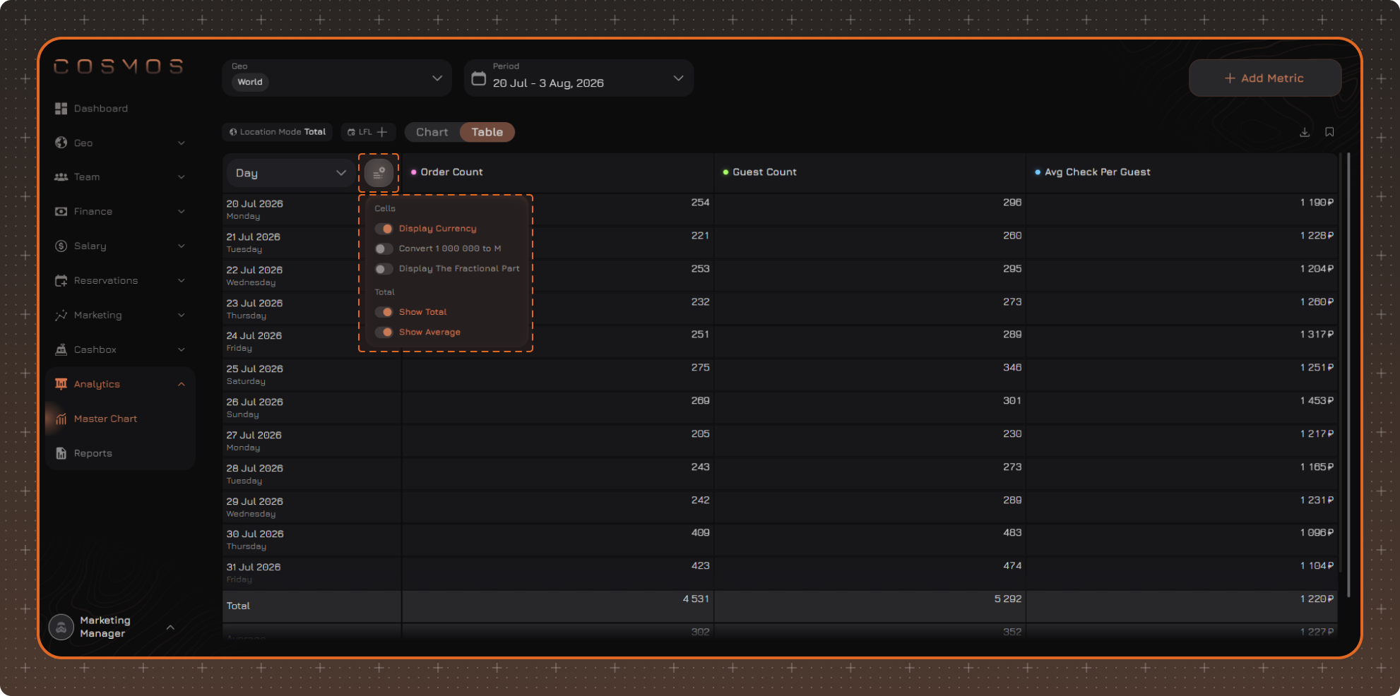
Cells
- Display Currency
- Convert 1 000 000 to M
- Display The Fractional Part
Total
- Show Total
- Show Average
Export
Export is available in both Master Chart modes. The file is downloaded in CSV format.
To export data, click the download icon in the upper-right corner of the chart or table.
The export includes the displayed metrics, taking into account the selected period, grouping, and applied filters. Metrics hidden with the eye icon are not included in the export.
In the Chart mode, detailed data is exported: metric values for each period for each selected location, and the totals for all locations.
In the Table mode, the table is exported as it is displayed on the screen.
The finished file is saved in the Export section at the bottom of the side menu and is available for download for 24 hours.
Saving a Report
Master Chart settings are kept during the current session. You can go to another section and return to the Master Chart without having to configure it again.
To save a configured Master Chart for later use, click the save icon in the upper-right corner of the chart or table. The report saves the selected locations, period, metrics, and filters, as well as the current view mode — Chart or Table.
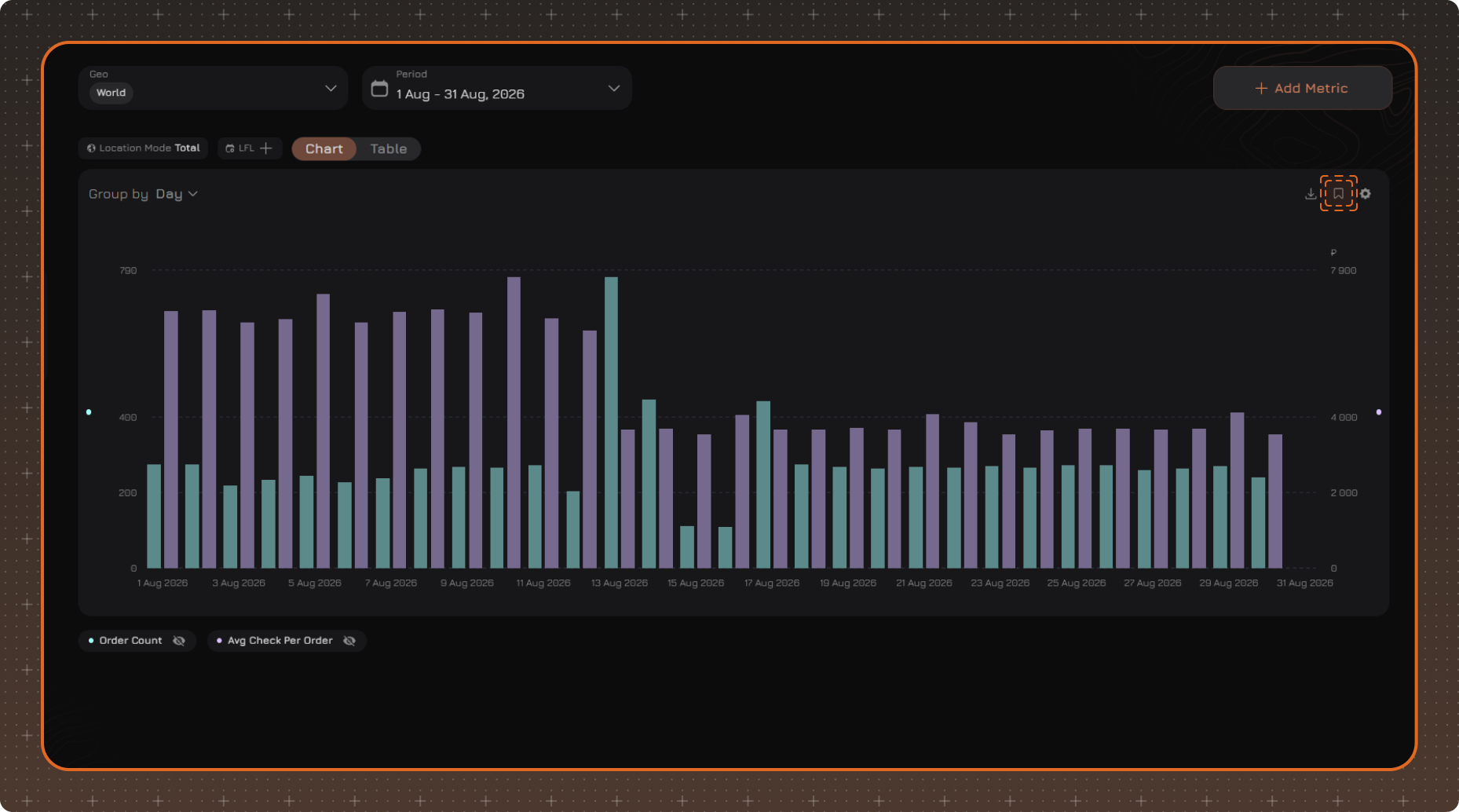
Enter the report name and make it shared if necessary. By default, a report is private and available only to its author. A shared report is available to other users of the Analytics module.
The list of saved reports is available on the Reports page.